
As the United States commemorates the 250th anniversary of the American Revolution, General Edward Hand’s letters provide a rare first-hand look at the experiences of a Lancaster officer serving in George Washington’s army. Written to family and trusted friends, they reveal the personal side of a war that would shape a nation.

The Process
1.
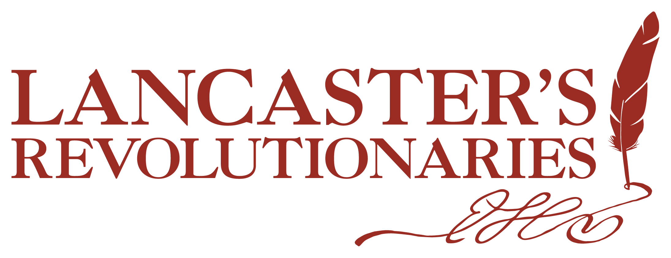
Historic Rock Ford’s America250 Logo
Inspired by the Lancaster rosette featured in Historic Rock Ford’s logo, visually tying the organization’s identity to its America250 celebration.


2.
conceptual direction
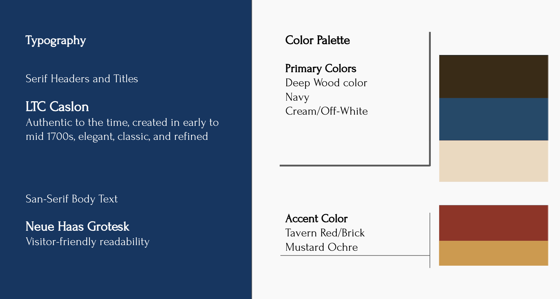
The color palette reflects patriotic tones while avoiding overly literal red, white, and blue combinations, and the typefaces are inspired by forms commonly used in the late eighteenth century.
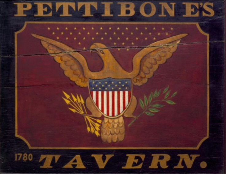
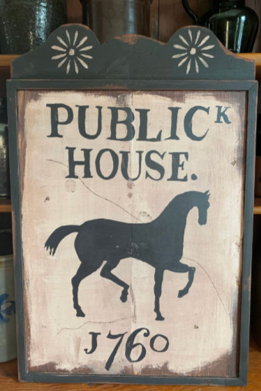
This approach also informed the tavern-inspired aesthetic, referencing the important role taverns played as places where people gathered to converse, exchange news, and discuss revolutionary ideas.
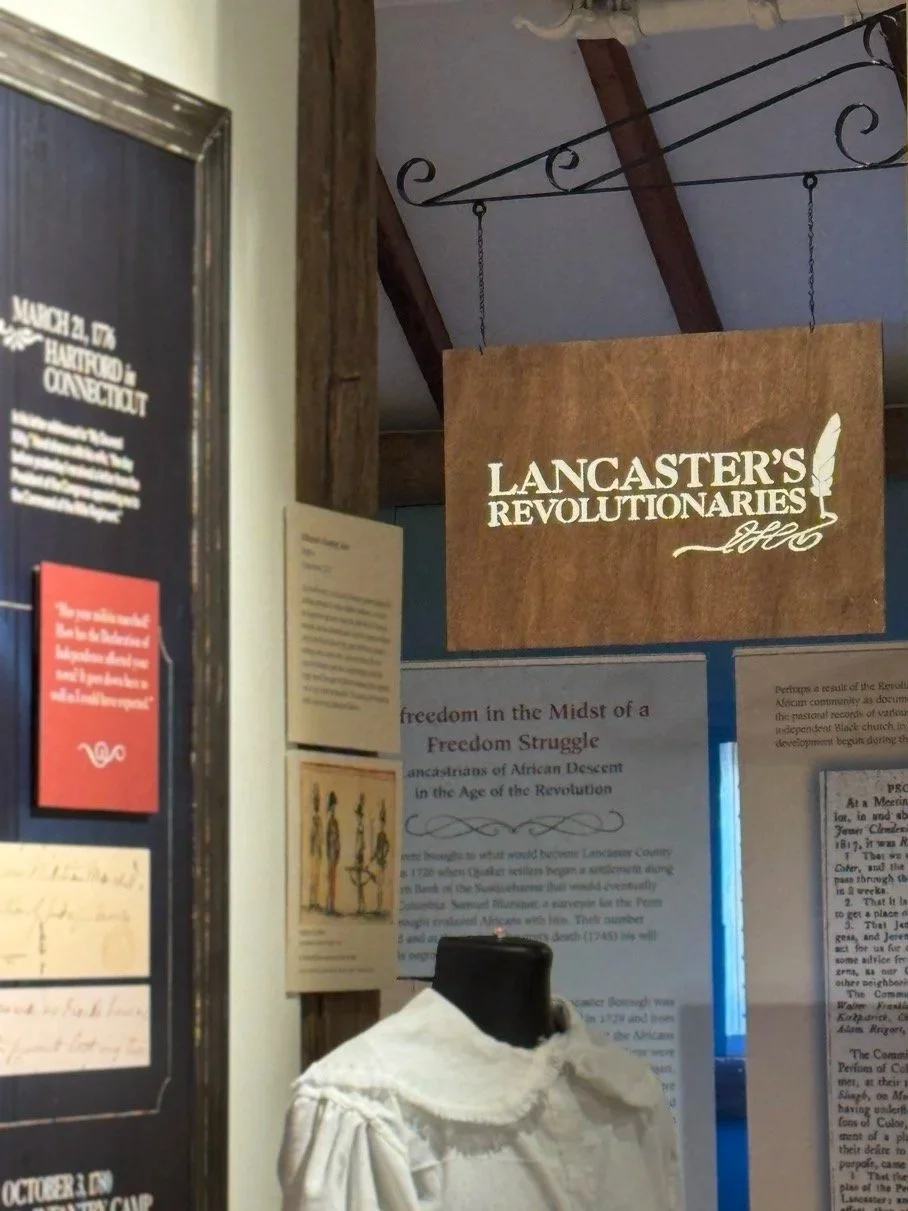
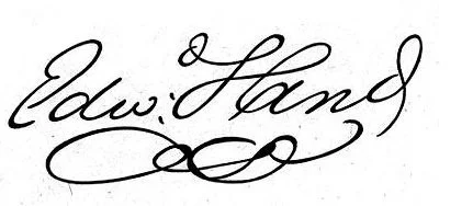
3.
Lancaster’s Revolutionaries Exhibit logo
Inspired by Edward Hand’s handwritten initials from his letters, tying the Lancaster’s Revolutionaries exhibit identity to the personal documents at the heart of the story.
4.
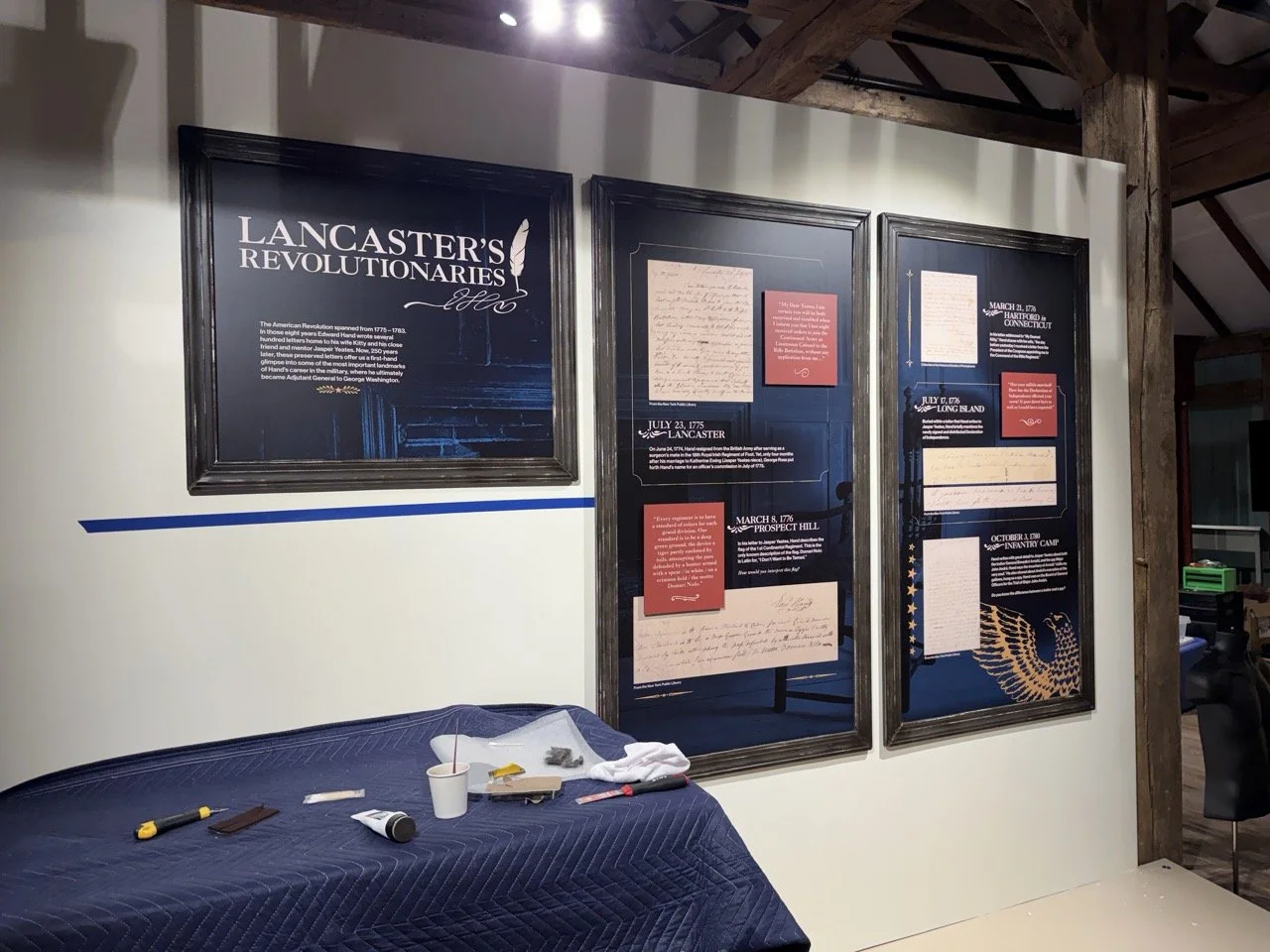
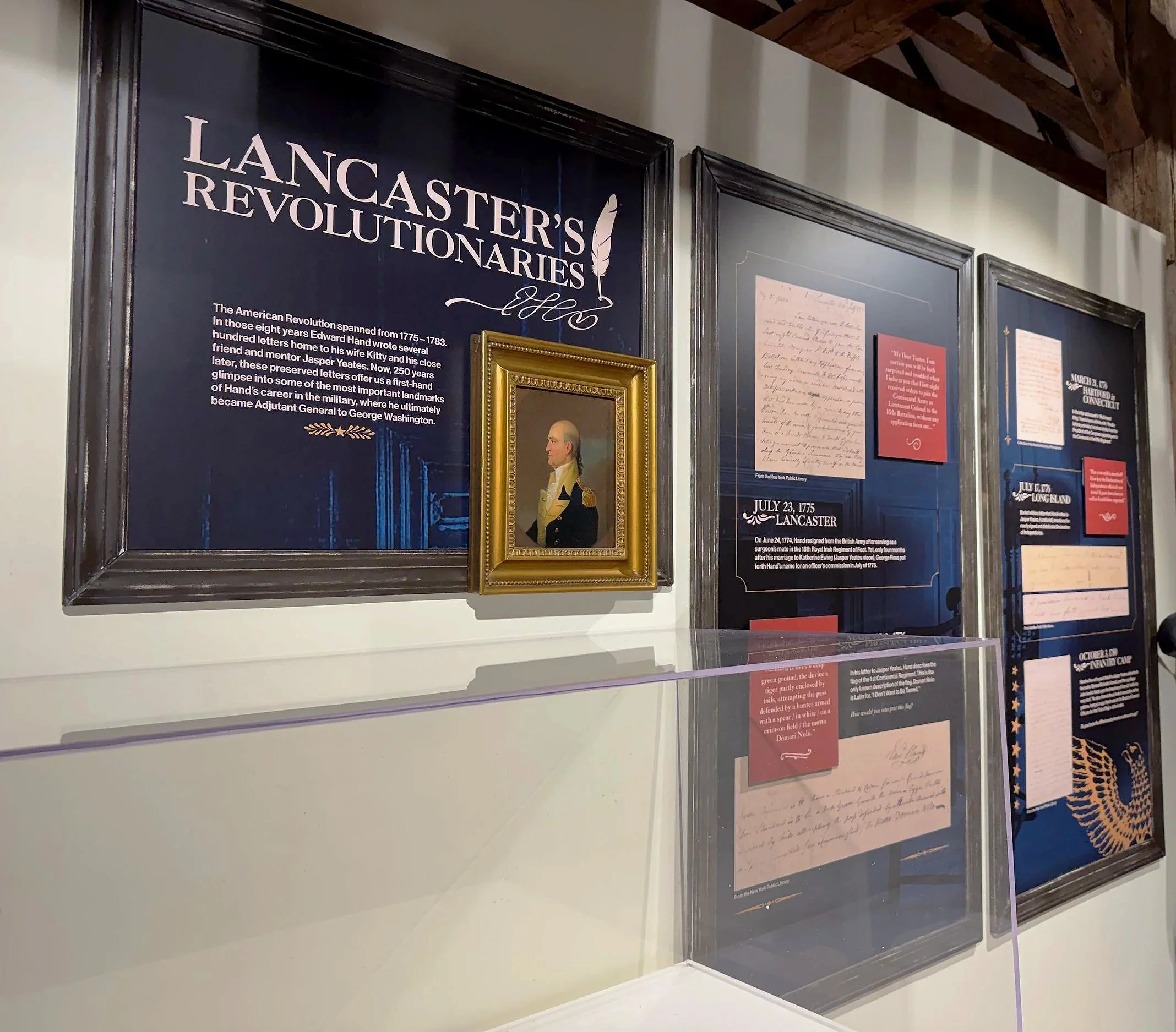
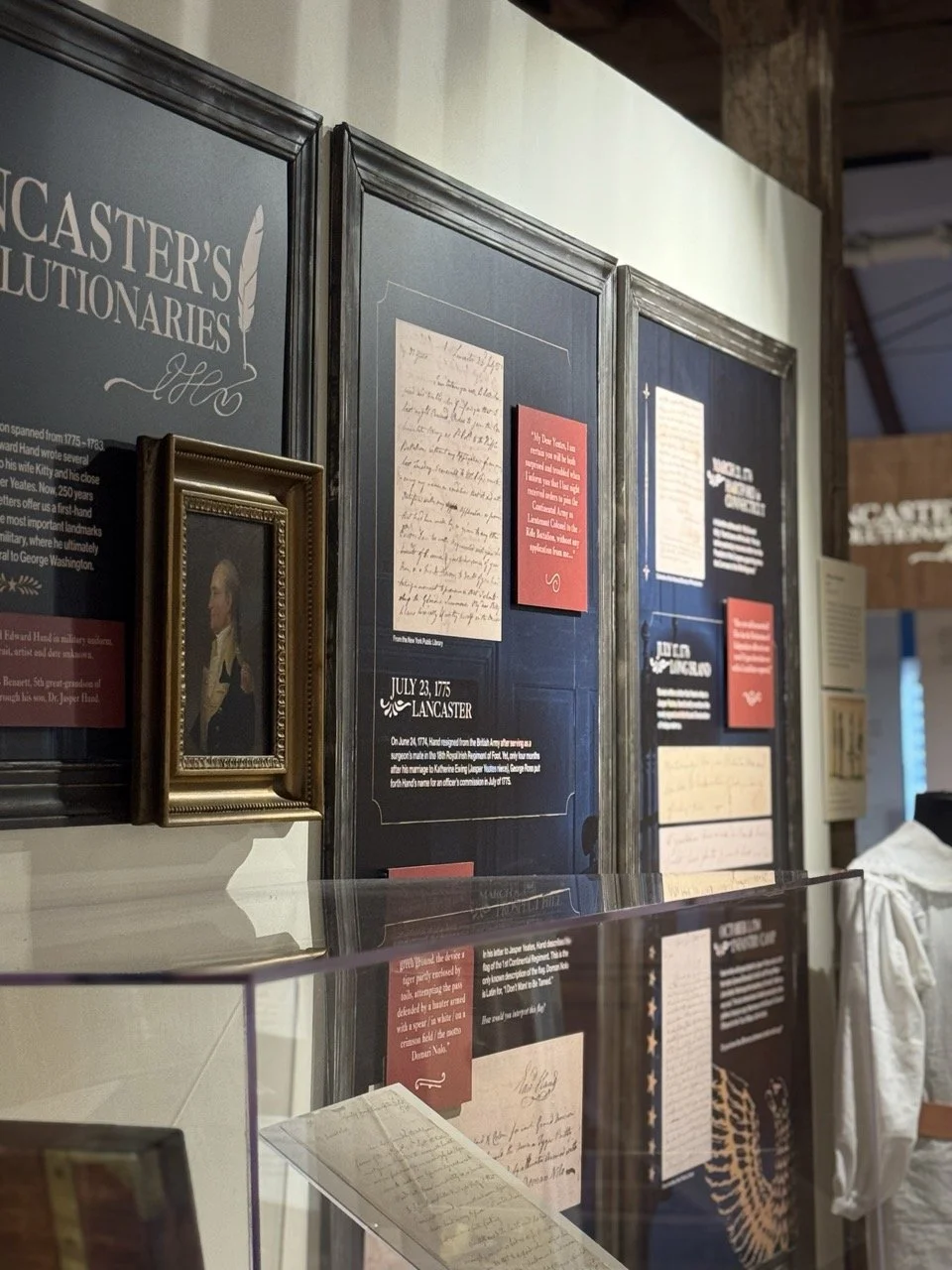
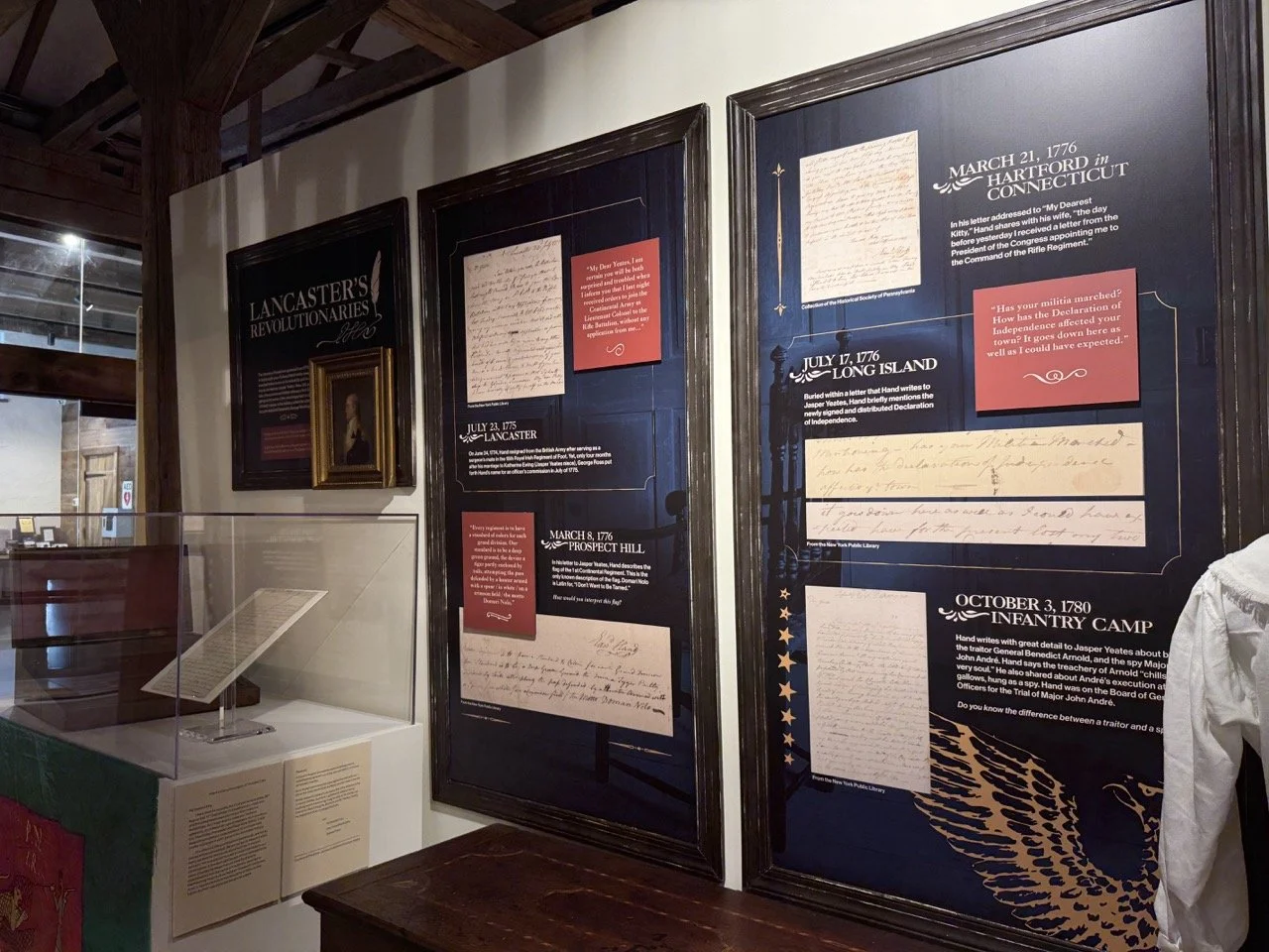
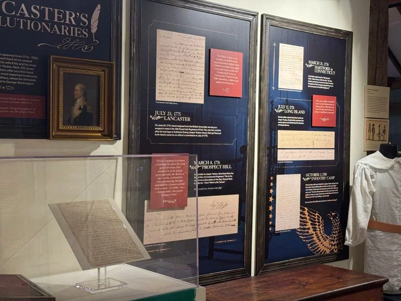
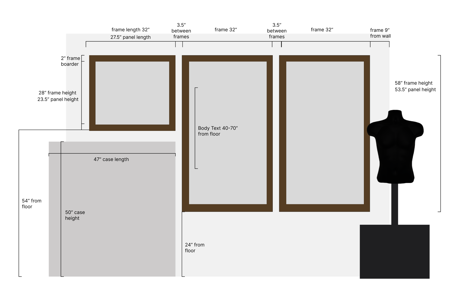
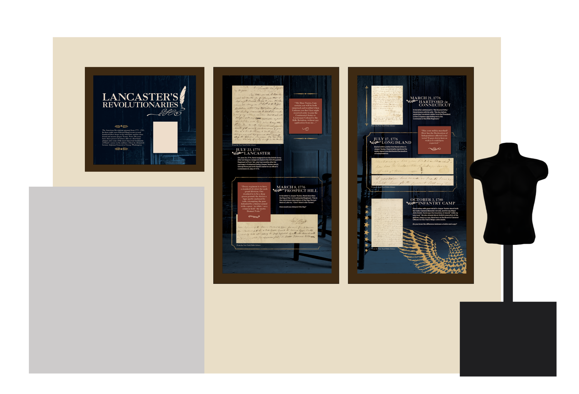
Exhibit space layout
For this step, I explored ways to organize the 8-by-10-foot wall to make the content digestible and engaging.
Dividing the information into distinct sections and placing it within “window frame” elements allowed me to evoke the feeling of looking back into a Revolutionary-era tavern, connecting viewers to General Hand’s letters that narrate the era.
5.
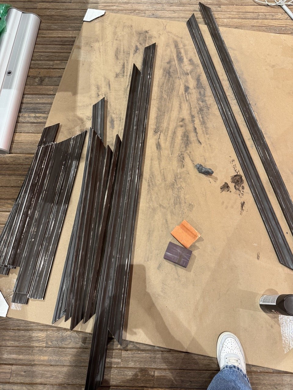
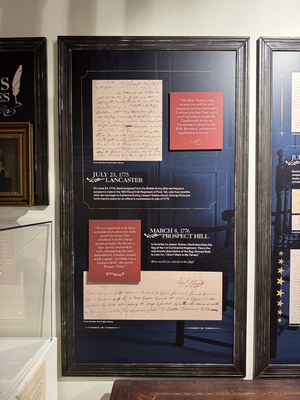
Determining Graphic Elements
In this step, I defined the visual elements for each panel section.
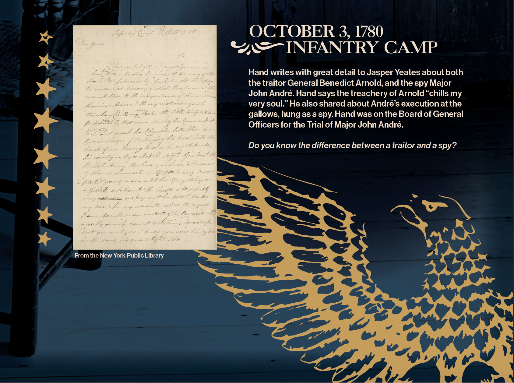
This includes borders and pen-swirl motifs typical of the era, symbols like the eagle representing war and peace, and iron-inspired graphics that reference the signage and decorative metalwork common in the eighteenth-century.
6.
Final Panel Design
In this step, I arranged the panels to establish the final visual flow of the exhibit.
Mockups allowed me to test how the sections and elements worked together within the exhibit space, ensuring the narrative, design details, and historical references were cohesive and readable.
7.
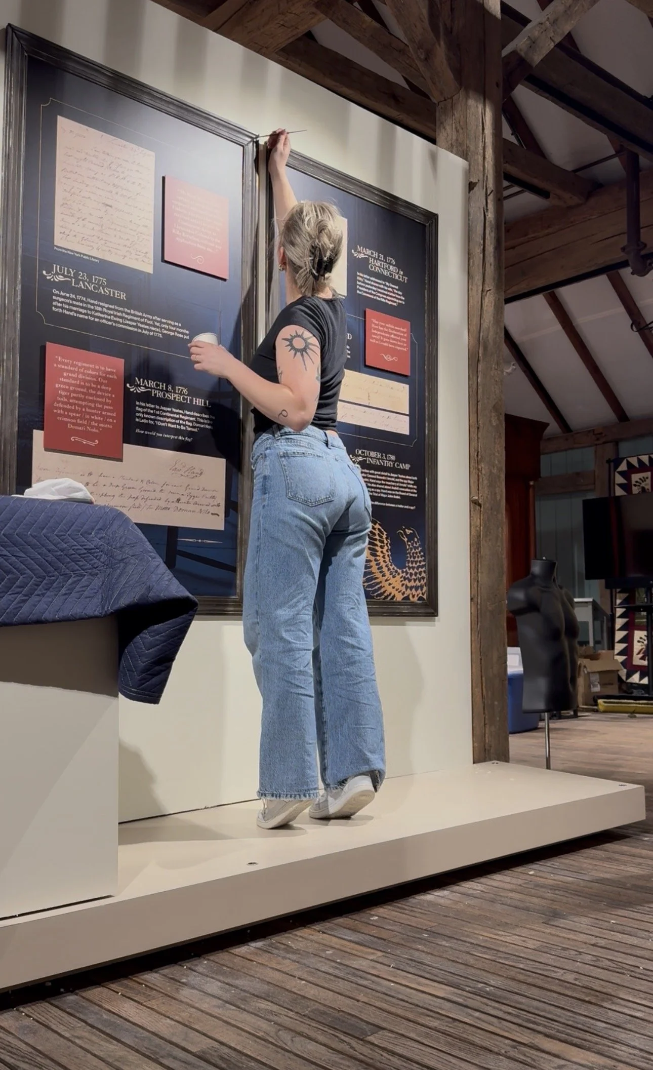
Install!
Once the final design was approved and printed, we installed and fabricated the exhibit.
This involved translating the mockups and layouts into the physical space, ensuring proper alignment, spacing, and readability.